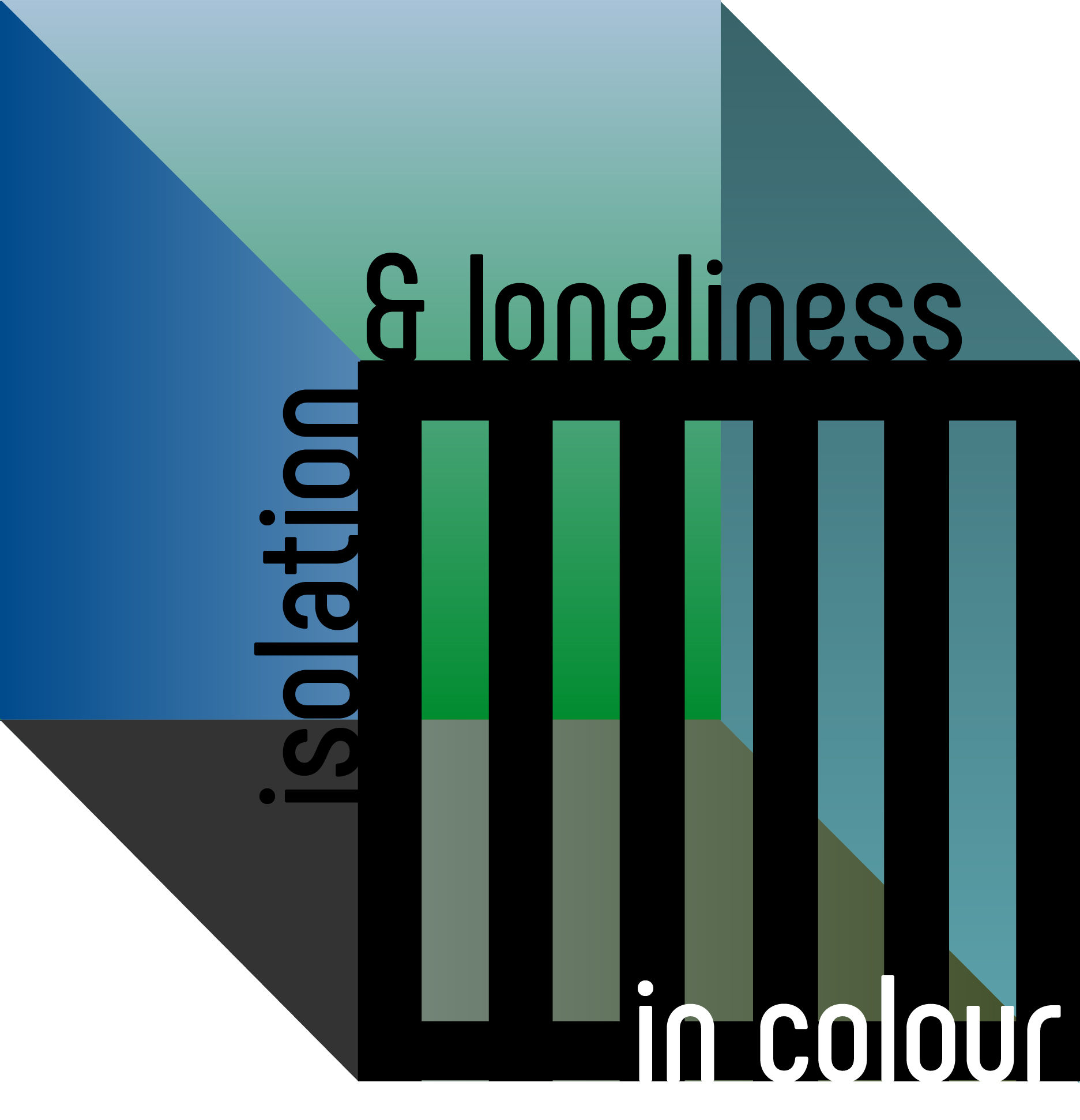
Isolation and loneliness in color
An analysis of the use of colors in visual communication
This article examines the use of colors in visual communication, such as in illustration, film and book covers, that represent the mental state of loneliness and isolation. Applying the Semantic Color Space as an analytical tool, some distinct color combinations and specific hues emerge that represent different aspects of seclusion and loneliness.
Networks in this article are derived from the Design Semantics Knowledge Graph.
PRIMARY COLORS
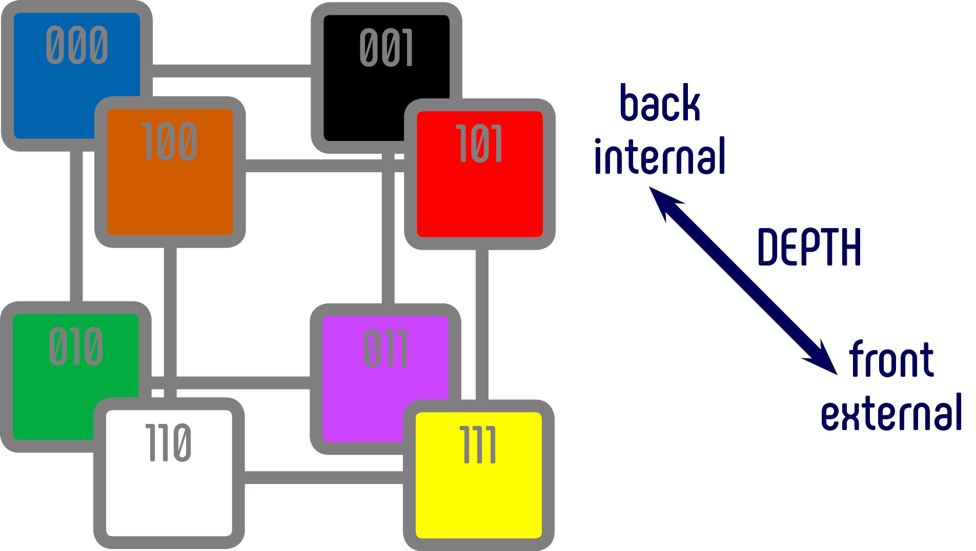
The colors blue, green and black are the most commonly used in visual communication depicting isolation and loneliness. In the Semantic Color Space, these three primary colors are all located at the back. In the depth dimension, this suggests a meaning with a strong focus on the inner world of thought.
These three primaries, in the context of isolation and loneliness, might express the following notions:
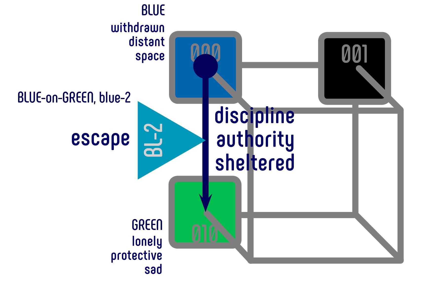
BLUE
GREEN
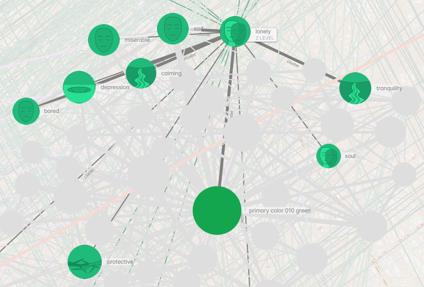
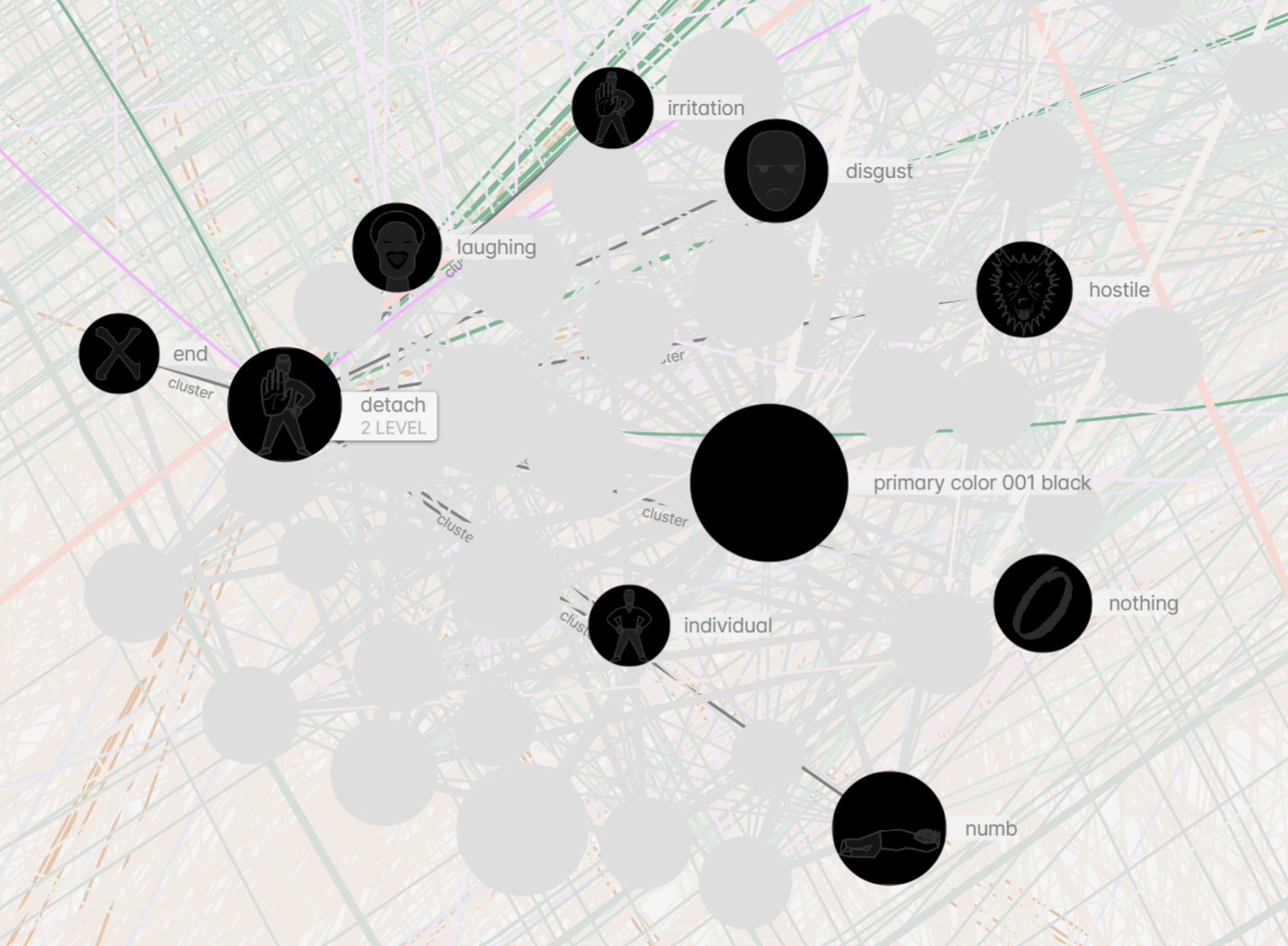
BLACK
COLOR COMBINATIONS AND SPECIFIC HUES
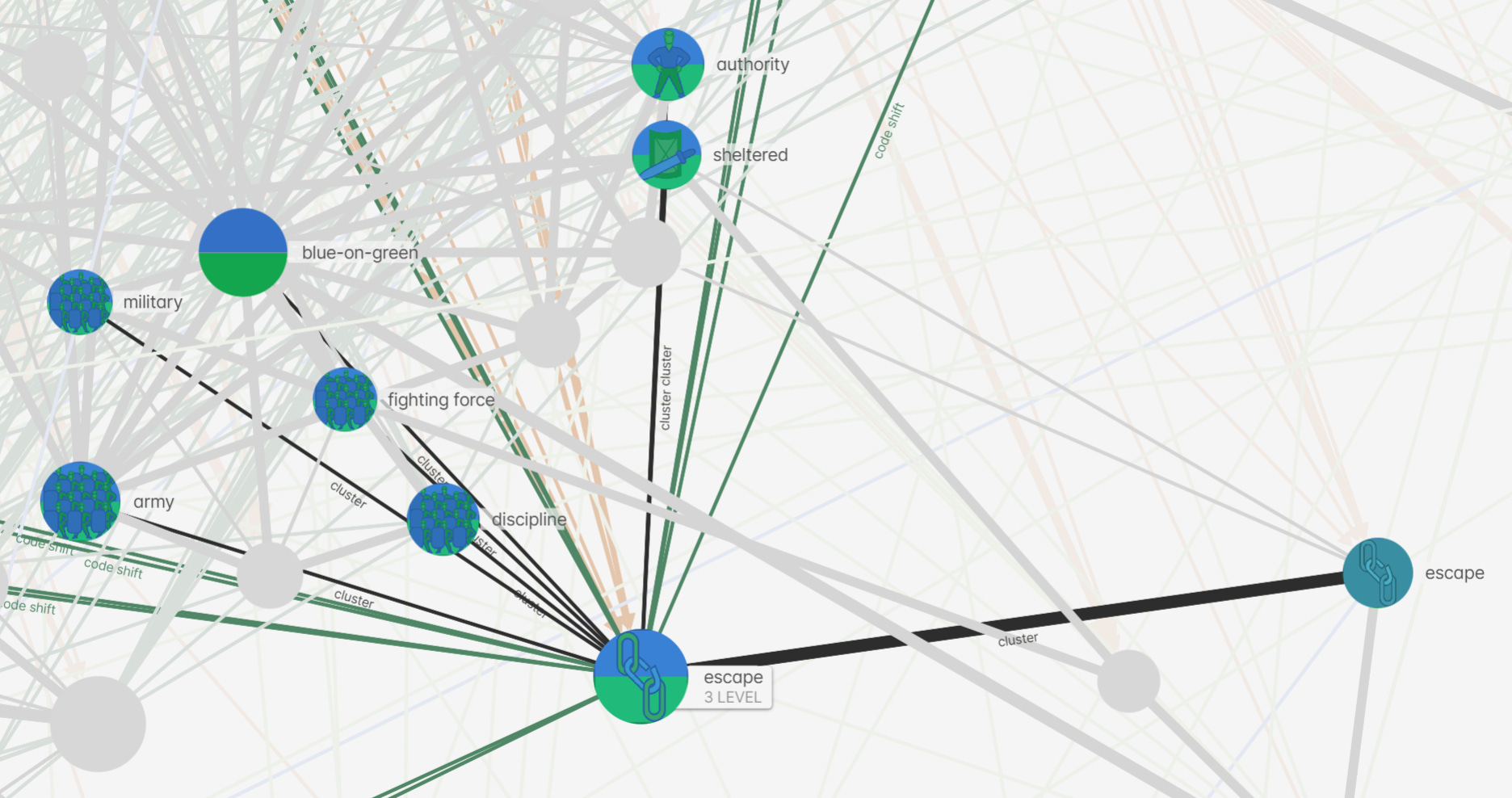
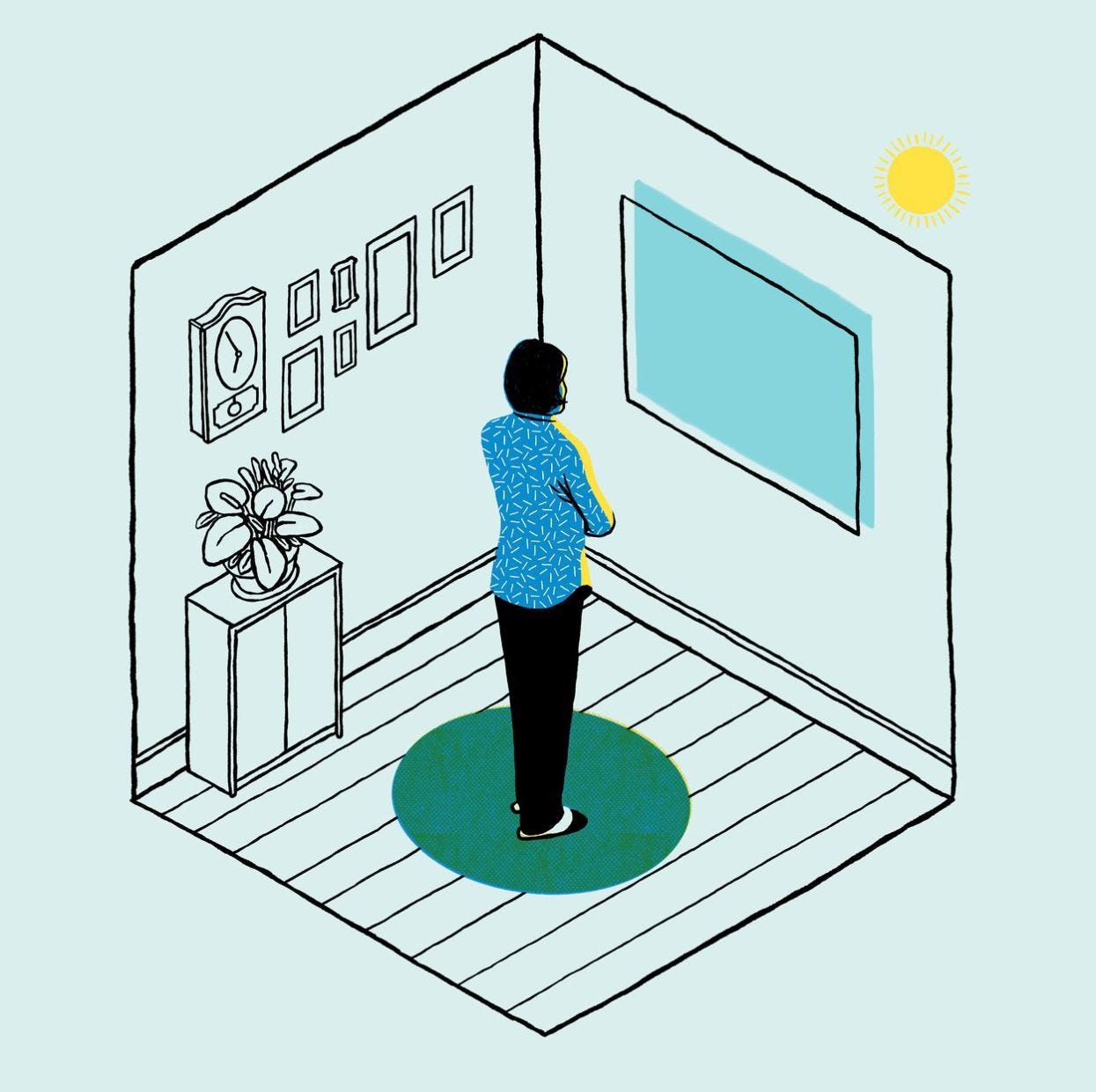
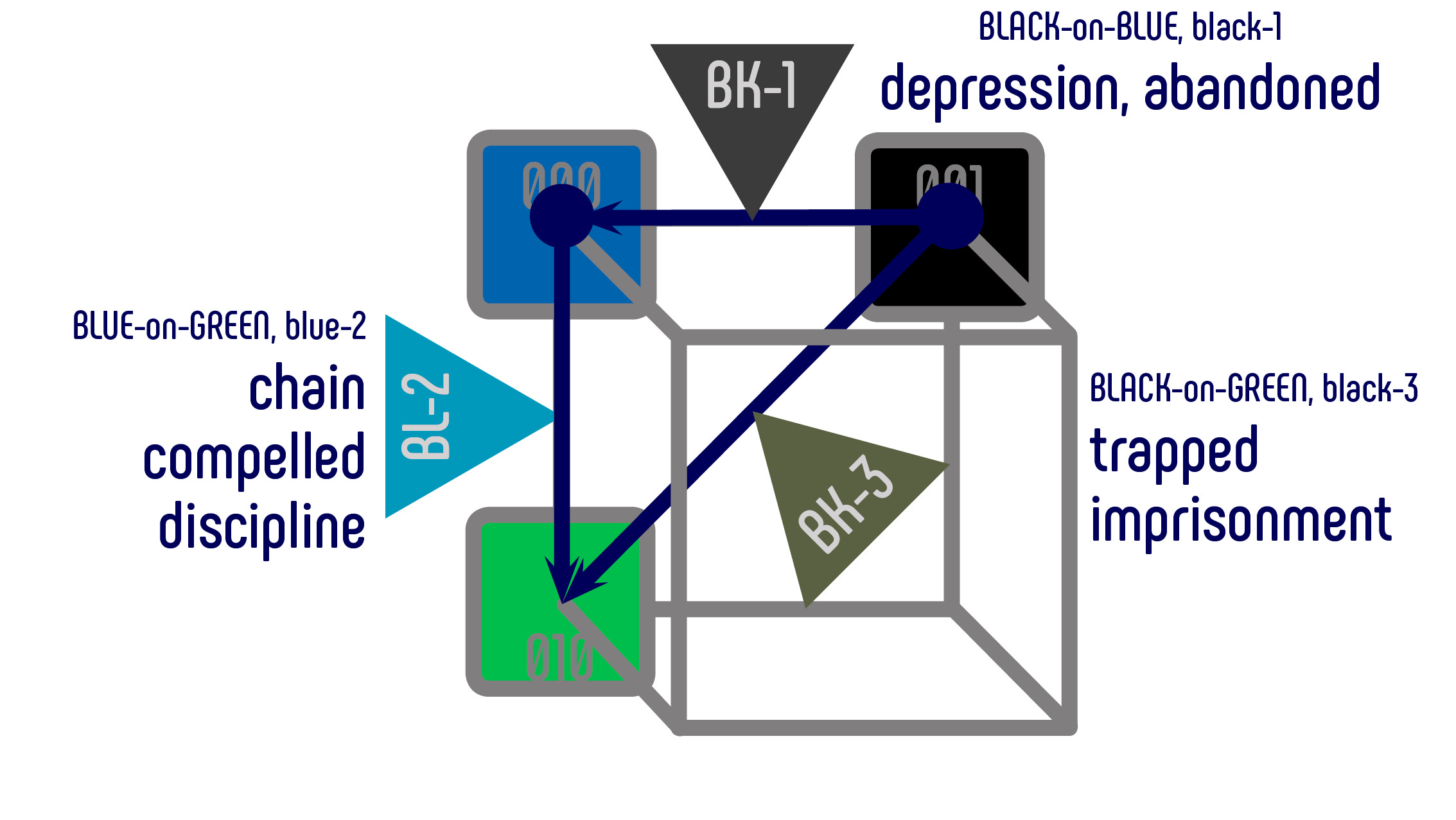
In the context of being alone in a closed space, the blue-on-green color combination and the semantically associated hue turquoise blue (blue-2) express a compelled isolation. In the case of Covid-19 for example, that would be a disciplinary measure imposed on citizens by the government, or self-imposed for fear of contamination. This situation for civilians could metaphorically be described as civilians chained to their homes.
Some examples

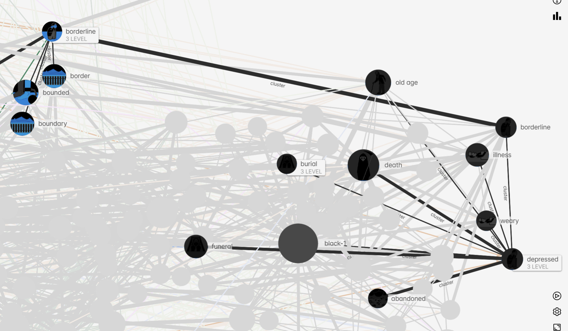
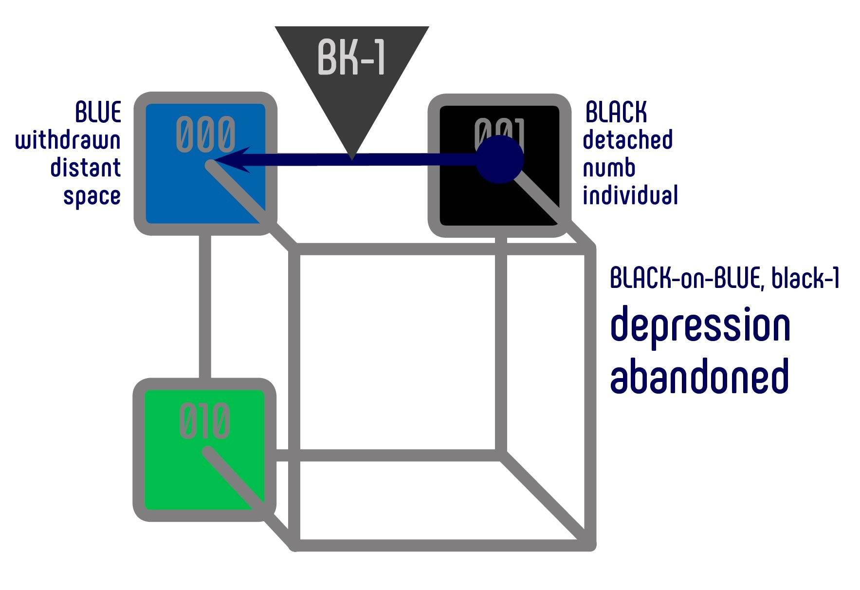
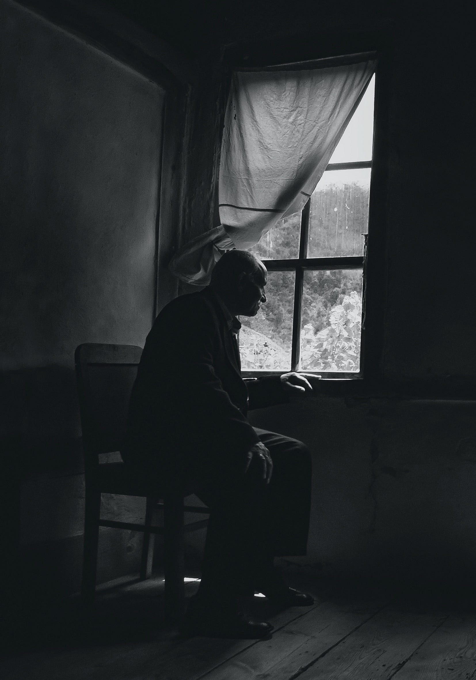
When the emphasis of isolation is placed on the feeling of utter abandonment as a mode of a depressed mental state, the color combination black-on-blue and the semantically associated hue dark gray (black-1) are frequently used in visual communication.
Some examples

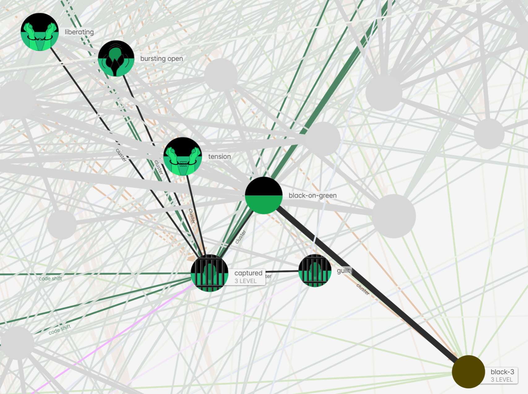
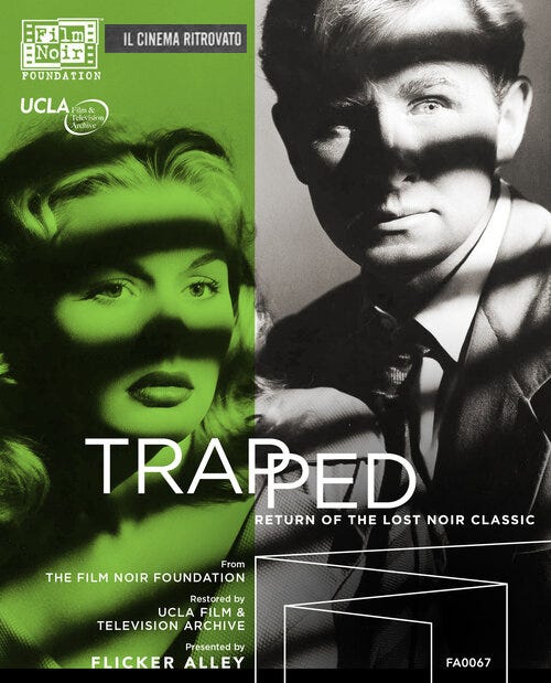
In case the isolation is characterized as a capturing or imprisonment, the color combination black-on-green and the semantically associated hue olive drab (black-3) are best suited.
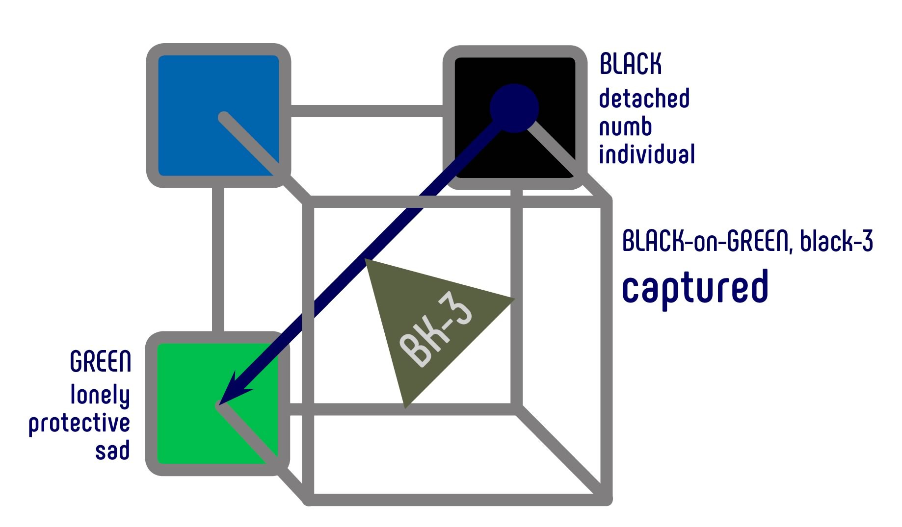
Some examples

The Semantic Color Space reveals the close metonymical relationship of concepts found in the colors of visual communication, expressing loneliness and isolation.
When combined …
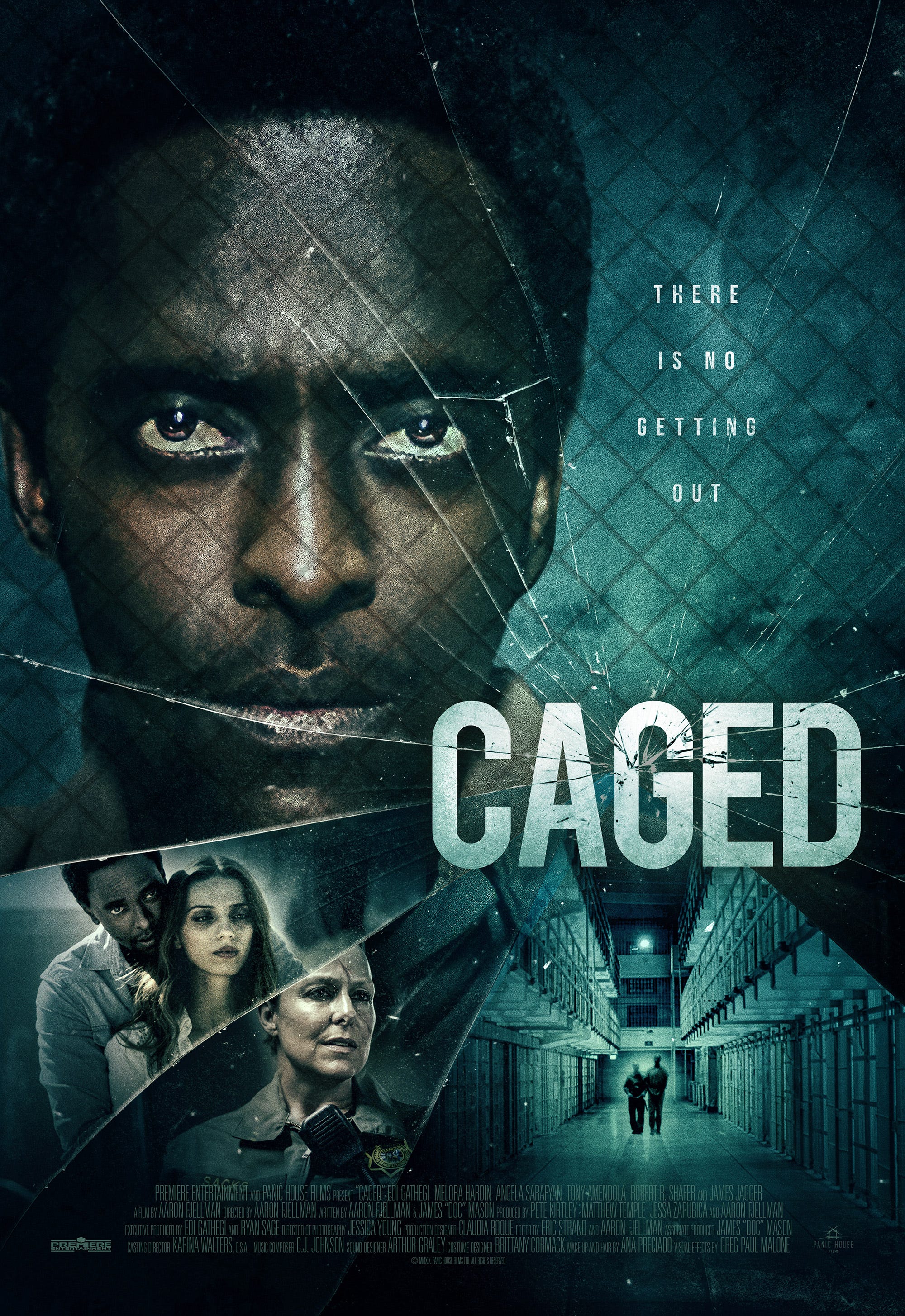
The poster for the film Caged combines different aspects of the idea of loneliness and isolation. The use of turquoise in the background conjures up the notions of chains and forced isolation. This ambiguous hue can be seen as blue-green as well as green-blue. With black in the foreground, we can evoke the feeling of being captured (black-on-green), and the presence of an ensuing depressed mental state (black-on-blue).